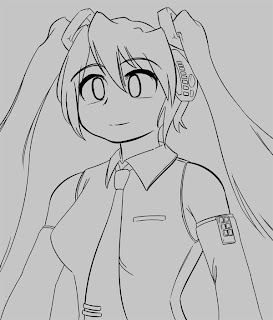
The first thing I do is set a grey background. This is partially so I can see colour bleed more easily, but the main reason is to set the overall tone of the picture - white is very distracting when I'm trying to choose colours.
Since I want pale colours, I go for a fairly pale grey.

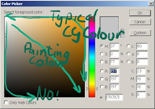
A quick note on choosing colours. If you're not used to colouring stuff then it might be a good idea to sample pictures that are similar to what you want, at least to see what colours are typically chosen - its somewhat hard to guess the RGB values of a colour just by looking at it, at least at first. Make sure you sample the base colour though, without any shading added to it.
If you sample colours from various galge CGs, you'll probably notice that whatever the hue you're choosing, the colour is always very saturated - towards the top and right sides of the colour picker. CGs always seem to use vibrant saturated colours - even when a grey is seen, it typically has a large amount of saturated colour in it (often blue or red). It's pretty rare to see a true grey (ie. no hue / saturation) used. This isn't a rule or a recommendation, just an observation.
The usual colour associations apply (blue for cool, red for passionate, etc) but you'll probably notice a lot of complementary or opposing colours being used.

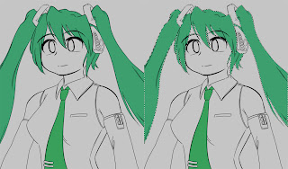
Time for some colouring. The REALLY important thing here, rather than just colouring the areas, is to establish a mask for each area of colour. You could do that with layers and masks, or by using a layer per colour; the method I tend to use is to paint all the colours on one area using the pencil tool (which has no blending). This gives me a bunch of areas of solid colour that I can select. This mask allows you to adjust your colour scheme easily, and is also used extensively for shading.
Obviously, you can use the flood fill tool and your lineart to speed things up a little. You can also use the masks you have already completed to easily create the mask for neighbouring areas, since implicitly there won't be any overlaps.

Keep going until you fill in all the whitespace in your lineart. Once it's all masked, you can fiddle with the colours until you're happy that they work together.
Note that even though she is wearing grey, it's actually tinted blue - compare it to the background grey. I used blue to complement her green motif and skin colour. Or something.
Thats all we need for base colours and masks; next is the start of shading!
No comments:
Post a Comment