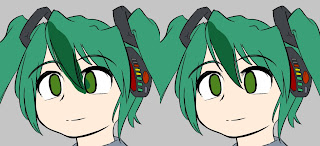
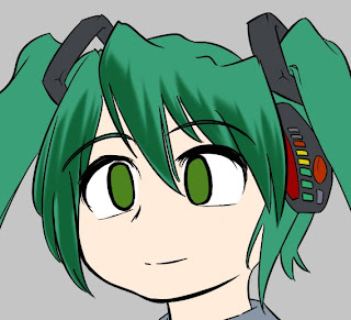
To start with, make a new layer to store your finished shading. You might want to make one per colour or one per area; however since you have the masks that you made in the previous step, I find it more convenient to just put all colours of shading onto one layer and use the mask to seperate them if I want to adjust colours.
When shading an area, the first step is to choose your shading colour. Grab the base colour and adjust it as you see fit; typically you'll be reducing both the saturation and brilliance, but it's often nice to change the hue a little as well. The hue changes due to the effects of ambient light; it's particularly affected by unusual lighting conditions too, such as moonlight or otherwise coloured light (go look at other art or photos).
Another case where hue is affected is skin colour; skin is slightly transparent, and so the red colour from capilliaries tints the shadows slightly red - ever tried shining a torch behind your hand? Here's a basic description; it gets kind of technical when applied to human skin, so try observing photos and so on, or just wing it.

Time to get started. Make a new layer, and throw a blob of colour on that is bigger than the shading you want. Use the mask to trim the unwanted bits, and manually trim anything that overlaps inside the mask where you don't want it to (its easier of the initial blob doesn't overlap, obviously).

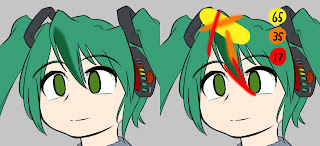
Now, grab your eraser, set it to be a soft brush of appropriate size, and trim away parts of the blob to give a nice gradient edge. Use different sized brushes to give different gradients - here I used a 65px, 35px and 17px brush, with strokes as illustrated in the 2nd picture. This gives you a good amount of control over the shading - I find that its much easier to form smooth gradients by removing colour with the eraser brush rather than trying to add it with the colour brush.
I don't want to force my opinion of how to actually perform the shading, since I don't think I'm particularly good at it; still, basic advice would be to keep in mind the position of your light source, since you are effectively drawing shadows, and that when it comes to anime-style CGs, its generally both nicer-looking and faster to keep things simple.
Another odd rule is that it looks nice if you erase a little of the shading where it meets the lineart (as with the lowest 17px stroke above). I'm not sure why; something to do with ambient light and reflection? But you can see it a lot on professional drawings; it looks nice, especially with skin.
Once you are done with the blob, you can merge this layer back with the rest. If you are happy with it you can merge it back into the main shading layer; I tend to keep a main layer for the whole masked area that I'm currently working on so that I can touch it up before I merge it back to the main layer. Be careful that you don't accidentally merge layers badly and ruin your base colours or masks! Plus, be careful to apply the mask to the area before merging back into the main shading layer or you might end up ruining completed work - I haven't found any quick, practical way of preventing this, so you'll just have to be dilligent and keep a large undo stack...

Keep making layers, trimming blobs and merging back until you've completed each masked area. Since the brushes have a limited size, you can save some time by doing several blobs at a time, spaced apart enough that you can erase one without overlapping with the next one. For example, I painted half the fringes on one layer y doing every other spike, then the other half on a second layer, instead of making one layer for each spike.

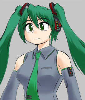
And so, we have a shaded Miku. We're not done with the shading yet though...
No comments:
Post a Comment