I'm not intending this to be a 'do this for good art' kind of thing, since I'm far from being an authority on either art or techniques; this is just going to be a summary of the basic stuff I go through to make a picture, in the hope that people who already draw and are exploring ways to make clean art find it useful.
Some general comments before I start:
I use PaintTool SAI for lineart - it has some really nice control settings for lineart, so you can do nice crisp thin lines - Photoshop has some settings for that but it isn't convenient for doing both lineart and colouring. SAI is god for painting, but I don't tend to do that, and I still prefer Photoshop for CG colouring.
I have a 1200 square canvas (so it's roughly screen-sized at 100% zoom), and draw the roughs at 100% and the final lineart at 150% - this is to speed things up without it looking crappy, and also so the lines are a good size on screen (a couple of inches on a tablet - this is more important for me than resolution). I have a layer with a block of colour on it that I use to crop a nice view of Miku before saving. I'm also using a hard 12 pixel brush, but due to pressure variance I'm probably usually drawing a 5-6 pixel line - for the resolution, even this is probably quite thick, but I tend to resize the image a little to hide minor faults. Its also easier to colour lineart that is at least 2-3 pixels thick. Uh, I can't think of anything else...
So! Lineart! As an arbitrary subject, I'm doing Hatsune Miku, since I wanted to draw her sometime, and I wanted a subject who lent themselves to fancy game CG-style shading. I was going to have her singing, but I dropped that and kept the pose simple since it's a tutorial...
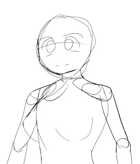
I start off with a layout sketch for just about anything I do; it helps break habits, and also avoids problems later on with propertions. Only the silhouette is important, really; the eyes and some details are there but only to make sure they're positioned correctly but I'll be redrawing them when I'm 'inking' it.
If you're good at drawing on paper then you can scan the rough and skip to the inking. (If you're good at inking on paper then you should probably skip all of this...).
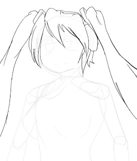
Since the hair is kind of complex and overlaps, I do the rough for it on a seperate layer. The previous rough gets set to 10% transparency so that I can still see the silhouette, but it doesn't interfere with the current work.
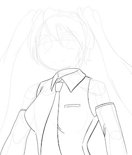
The clothes are next. They're also done on a new layer. Since they're based on the previous layout and I seem to be pulling it off ok, I skip the rough and just ink directly.
'Inking' is just a process of producing clean lines - I don't want to try to influence anyone too greatly since its an artistic choice, but at a technical level, this basically means doing each line as one stroke, or hiding the fact that it isn't if you have to break it unto two unnaturally. For me this means lots of undo-ing when I don't like a line, or using a temporary layer to clean up the line if I can't avoid overlapping other lineart (such as when two lines meet and I want a nice join). Beyond that, look at what your favourite artist does, or look at how people do particular areas - as example, a lot of people thicken lines on the chin or eyes in particular ways, or vary the thickness a lot on lines that are curved.
Here's a video of Gabe from Penny Arcade inking a picture, which demonstrates the 'single stroke' thing pretty well:
(Don't worry, it's running at 2x speed, he's only semi-superhuman.)
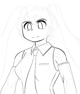
Skin parts and face. I did this on a new layer, then cleaned the overlapping parts and merged back into one layer since there are no overlapping parts. After this, I'm done with the body rough so I hide it.
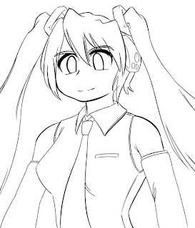
Hair next. Since it overlaps the face it gets a new layer. I redrew a bunch of stuff from the rough - it's just a layout so I don't bother with details, but I also decided that the hair ornaments were a bit flimsy in the rough and beefed them up. This is a simple picture, but normally I do that a lot more.
Again, I turned the other lineart transparent while I was doing this so that it didn't distract me, then made it opaque again once I was done. The hair rough gets hidden now too.
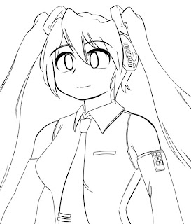
Time for some greebles and fixes. After seeing it with the hairline, I didn't like the haughty expression, and since the face is a seperate layer I just fixed it without redoing her hair. I also noticed that I'd missed some details from the original design, and fixed her skinny arm - you can't meddle too easily once you start colouring, so it's now or never.
After this, hide all your roughs, and lock your lineart layer so you don't draw on it like a dumbass... You should also set the layer to 'multiply' if you have it on a white background, the white becomes transparent and the black remains.
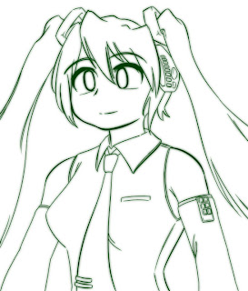
Another thing you see a lot of is that, when people are posting lineart they intend to colour later, they touch it up a little. Just duplicate the lineart, do a light gaussian blur on one (2-5 say, depends on how thick your lines are), group them with a colour layer, and you're done.
No comments:
Post a Comment