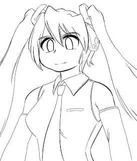
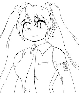
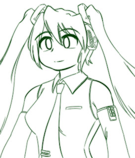
My computer got fixed! I got my files back! Now I can finish this off!
...is what I thought a month ago.
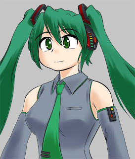
This is the last major part of colouring - adding brighter areas to reflective surfaces. Anything that isn't completely matt reflects light to some extent - depending on your style, this might be represented as anything from white spots through to full gradient lighting with correct colour reflection, but things will look better if you add some lighting in the right places.
I usually only do a single subtle layer. Splodge down some white, and erase to make gradient edges as appropriate. Then, adjust the opacity of the layer as you see fit - this is around 20%. Since the core of the white areas was originally opaque, this gives you nice even intensity across all the areas on the layer.
If you want to vary the intensity, you can either use multiple layers, or if you're feeling lazy, apply a large low-opacity eraser to the whole area you want to fade, to maintain your even intensity.
The reflective areas will have a 'bright' spot at the center - you can represent these as small full-intensity white spots at the core of the highlight areas. This is kind of exaggerated - Miku's suit appears to be made of rubber, and CG skin always seems to be highly polished for some reason, but it looks nice and that's what counts, right?.
Even if you skip the previous step, doing the high-intensity spots tends to work well.
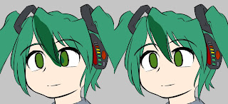
For hair, I normally do a simple pointed stripe (as seen here) but since I'm doing a tutorial, I went and looked up how to do fancy zigzag highlights that you see so often. Should I be explaining something I only just discovered?...
Basically, you splodge down a reasonably thick line in the shape you want the highligh to follow, then use a high-opacity smudge to smear it into a spike. It tends to come out a bit transparent, but you can just clone and merge the layer or whatever to make the core opaque. It also needs some deft touches to make it clean and consistent, but its quick and easy to apply.
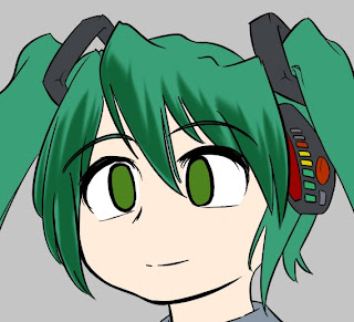
So, here's Miku with the aforementioned highlight applied. Again, the most intense areas are those facing the camera, so I partially erased the parts that would be at an angle.
It looks a bit odd with just a white highlight, so I applied two more steps.
The first was to group a green layer to it, to tint it slightly green (white is white, but the edges blend into green nicely).
The second was to splodge on some white behind it, apply a gaussian blur, and set the layer to 'colour burn'.
There's a strange effect you can get - if you make a layer folder (the folder icon) and set the folder to 'colour burn', the effect on contained layers is much more intense than you can get by setting it on the layers directly. It looks like Komatsu Eeji's stuff, although I haven't worked out how to use it that well...
A couple more things to finish.
The glow on her lights was just done by a copy, gaussian blur, colour dodge (or overlay? I forget).
Also, I added a slight blush. This was just done by taking her skin colour, adding lots of red, covering her face with it, then erasing down to highlight the cheeks and reducing the opacity of the layer. This lets you represent areas of skin that are normally darker than average - cheeks are an obvious use, some artists apply it to elbows and shoulders, or you could take it to an extreme and produce fairly realistic-looking skin like Masamune Shirow. I wanted to look at it a bit more, but I don't think it turns out well on Miku here, so I might revisit it.
Thats pretty much it for Miku... I don't think she came out spectacularly as a piece, but I think she works as a tutorial. I think I've covered the major technical stuff I do when drawing, but like I said at the start, don't take this as a list of 'stuff to do when drawing' - play with the steps I've suggested yourself, and also think about them when trying to work out how your favourite artist did a particular effect. It'll be more effective than just aping my stuff :p
And so, back to proper artings for me!
Monday, October 26, 2009
Sunday, August 30, 2009
How To Draw Anime CG: Colouring 3
We have some basic shading down, but it looks a little flat. This last shading step will add a bit of depth to it.
Start off by making another layer to hold the new shading.
Pick a region, and make a new deeper shading colour. You'll want something darker than your first shading colour, but you'll also want to change the hue more this time, since shadows are tinted by ambient light.
Select the original mask you made for it. Then, go to your first shading layer, and choose 'intersect transparency mask'. Make a temporary layer, and flood fill with your new colour. (This is to help avoid colouring over areas that weren't shaded on the previous layer; however there's nothing wrong with just painting a blob and erasing as before if you prefer).
Now, erase the new layer to reveal the previous shading. You want to leave the areas of heavy shadow untouched, and blend the rest of it into the previous shading, so the gradients will be a lot more gradual than before. I was using a 200px brush a lot here, as well as reducing the opacity of the eraser.
Keep doing this for all your masked areas. The shadows are a lot deeper and more subtle than before; keep it simple if you don't really 'get' the places that should be shadowed, but it will almost always look better with this. I also added a little of the 'shadowed edge' I've seen in other pictures - its another element I don't quite understand, but on curved surfaces, a lot of artists have a dark highlight along the edge of the transition beween light and shadow.
One point is that the skin is shadowed with a slight purple tinge - the skin colour has had a slight blue tint added to it. You see this a lot (try sampling!); I don't understand it, but it looks nice so I'll run with it.
Saturday, August 29, 2009
How To Draw Anime CG: Colouring 2
Now it's time for the biggest step: shading.
To start with, make a new layer to store your finished shading. You might want to make one per colour or one per area; however since you have the masks that you made in the previous step, I find it more convenient to just put all colours of shading onto one layer and use the mask to seperate them if I want to adjust colours.
When shading an area, the first step is to choose your shading colour. Grab the base colour and adjust it as you see fit; typically you'll be reducing both the saturation and brilliance, but it's often nice to change the hue a little as well. The hue changes due to the effects of ambient light; it's particularly affected by unusual lighting conditions too, such as moonlight or otherwise coloured light (go look at other art or photos).
Another case where hue is affected is skin colour; skin is slightly transparent, and so the red colour from capilliaries tints the shadows slightly red - ever tried shining a torch behind your hand? Here's a basic description; it gets kind of technical when applied to human skin, so try observing photos and so on, or just wing it.
Time to get started. Make a new layer, and throw a blob of colour on that is bigger than the shading you want. Use the mask to trim the unwanted bits, and manually trim anything that overlaps inside the mask where you don't want it to (its easier of the initial blob doesn't overlap, obviously).
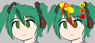
Now, grab your eraser, set it to be a soft brush of appropriate size, and trim away parts of the blob to give a nice gradient edge. Use different sized brushes to give different gradients - here I used a 65px, 35px and 17px brush, with strokes as illustrated in the 2nd picture. This gives you a good amount of control over the shading - I find that its much easier to form smooth gradients by removing colour with the eraser brush rather than trying to add it with the colour brush.
I don't want to force my opinion of how to actually perform the shading, since I don't think I'm particularly good at it; still, basic advice would be to keep in mind the position of your light source, since you are effectively drawing shadows, and that when it comes to anime-style CGs, its generally both nicer-looking and faster to keep things simple.
Another odd rule is that it looks nice if you erase a little of the shading where it meets the lineart (as with the lowest 17px stroke above). I'm not sure why; something to do with ambient light and reflection? But you can see it a lot on professional drawings; it looks nice, especially with skin.
Once you are done with the blob, you can merge this layer back with the rest. If you are happy with it you can merge it back into the main shading layer; I tend to keep a main layer for the whole masked area that I'm currently working on so that I can touch it up before I merge it back to the main layer. Be careful that you don't accidentally merge layers badly and ruin your base colours or masks! Plus, be careful to apply the mask to the area before merging back into the main shading layer or you might end up ruining completed work - I haven't found any quick, practical way of preventing this, so you'll just have to be dilligent and keep a large undo stack...
Keep making layers, trimming blobs and merging back until you've completed each masked area. Since the brushes have a limited size, you can save some time by doing several blobs at a time, spaced apart enough that you can erase one without overlapping with the next one. For example, I painted half the fringes on one layer y doing every other spike, then the other half on a second layer, instead of making one layer for each spike.
And so, we have a shaded Miku. We're not done with the shading yet though...
Wednesday, August 26, 2009
How To Draw Anime CG: Colouring 1
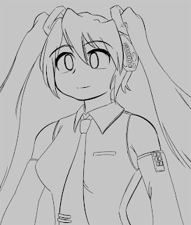
The lineart is done; now it's time to start colouring!
The first thing I do is set a grey background. This is partially so I can see colour bleed more easily, but the main reason is to set the overall tone of the picture - white is very distracting when I'm trying to choose colours.
Since I want pale colours, I go for a fairly pale grey.
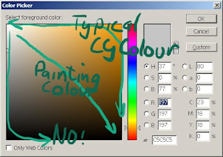
A quick note on choosing colours. If you're not used to colouring stuff then it might be a good idea to sample pictures that are similar to what you want, at least to see what colours are typically chosen - its somewhat hard to guess the RGB values of a colour just by looking at it, at least at first. Make sure you sample the base colour though, without any shading added to it.
If you sample colours from various galge CGs, you'll probably notice that whatever the hue you're choosing, the colour is always very saturated - towards the top and right sides of the colour picker. CGs always seem to use vibrant saturated colours - even when a grey is seen, it typically has a large amount of saturated colour in it (often blue or red). It's pretty rare to see a true grey (ie. no hue / saturation) used. This isn't a rule or a recommendation, just an observation.
The usual colour associations apply (blue for cool, red for passionate, etc) but you'll probably notice a lot of complementary or opposing colours being used.
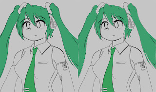
Time for some colouring. The REALLY important thing here, rather than just colouring the areas, is to establish a mask for each area of colour. You could do that with layers and masks, or by using a layer per colour; the method I tend to use is to paint all the colours on one area using the pencil tool (which has no blending). This gives me a bunch of areas of solid colour that I can select. This mask allows you to adjust your colour scheme easily, and is also used extensively for shading.
Obviously, you can use the flood fill tool and your lineart to speed things up a little. You can also use the masks you have already completed to easily create the mask for neighbouring areas, since implicitly there won't be any overlaps.
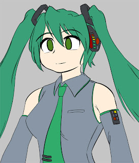
Keep going until you fill in all the whitespace in your lineart. Once it's all masked, you can fiddle with the colours until you're happy that they work together.
Note that even though she is wearing grey, it's actually tinted blue - compare it to the background grey. I used blue to complement her green motif and skin colour. Or something.
Thats all we need for base colours and masks; next is the start of shading!
Sunday, August 23, 2009
How To Draw Anime CG: Lineart
I always wanted to do some kind of tutorial covering the stuff I've picked up from scattered other tutorials. And since I'm too lazy and uninspired to draw anything else I guess its a good time to put one of those together!
I'm not intending this to be a 'do this for good art' kind of thing, since I'm far from being an authority on either art or techniques; this is just going to be a summary of the basic stuff I go through to make a picture, in the hope that people who already draw and are exploring ways to make clean art find it useful.
Some general comments before I start:
I use PaintTool SAI for lineart - it has some really nice control settings for lineart, so you can do nice crisp thin lines - Photoshop has some settings for that but it isn't convenient for doing both lineart and colouring. SAI is god for painting, but I don't tend to do that, and I still prefer Photoshop for CG colouring.
I have a 1200 square canvas (so it's roughly screen-sized at 100% zoom), and draw the roughs at 100% and the final lineart at 150% - this is to speed things up without it looking crappy, and also so the lines are a good size on screen (a couple of inches on a tablet - this is more important for me than resolution). I have a layer with a block of colour on it that I use to crop a nice view of Miku before saving. I'm also using a hard 12 pixel brush, but due to pressure variance I'm probably usually drawing a 5-6 pixel line - for the resolution, even this is probably quite thick, but I tend to resize the image a little to hide minor faults. Its also easier to colour lineart that is at least 2-3 pixels thick. Uh, I can't think of anything else...
So! Lineart! As an arbitrary subject, I'm doing Hatsune Miku, since I wanted to draw her sometime, and I wanted a subject who lent themselves to fancy game CG-style shading. I was going to have her singing, but I dropped that and kept the pose simple since it's a tutorial...
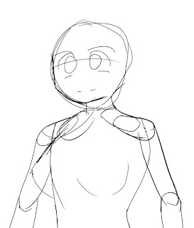
I start off with a layout sketch for just about anything I do; it helps break habits, and also avoids problems later on with propertions. Only the silhouette is important, really; the eyes and some details are there but only to make sure they're positioned correctly but I'll be redrawing them when I'm 'inking' it.
If you're good at drawing on paper then you can scan the rough and skip to the inking. (If you're good at inking on paper then you should probably skip all of this...).
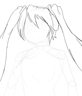
Since the hair is kind of complex and overlaps, I do the rough for it on a seperate layer. The previous rough gets set to 10% transparency so that I can still see the silhouette, but it doesn't interfere with the current work.
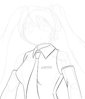
The clothes are next. They're also done on a new layer. Since they're based on the previous layout and I seem to be pulling it off ok, I skip the rough and just ink directly.
'Inking' is just a process of producing clean lines - I don't want to try to influence anyone too greatly since its an artistic choice, but at a technical level, this basically means doing each line as one stroke, or hiding the fact that it isn't if you have to break it unto two unnaturally. For me this means lots of undo-ing when I don't like a line, or using a temporary layer to clean up the line if I can't avoid overlapping other lineart (such as when two lines meet and I want a nice join). Beyond that, look at what your favourite artist does, or look at how people do particular areas - as example, a lot of people thicken lines on the chin or eyes in particular ways, or vary the thickness a lot on lines that are curved.
Here's a video of Gabe from Penny Arcade inking a picture, which demonstrates the 'single stroke' thing pretty well:
(Don't worry, it's running at 2x speed, he's only semi-superhuman.)
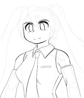
Skin parts and face. I did this on a new layer, then cleaned the overlapping parts and merged back into one layer since there are no overlapping parts. After this, I'm done with the body rough so I hide it.
Hair next. Since it overlaps the face it gets a new layer. I redrew a bunch of stuff from the rough - it's just a layout so I don't bother with details, but I also decided that the hair ornaments were a bit flimsy in the rough and beefed them up. This is a simple picture, but normally I do that a lot more.
Again, I turned the other lineart transparent while I was doing this so that it didn't distract me, then made it opaque again once I was done. The hair rough gets hidden now too.
Time for some greebles and fixes. After seeing it with the hairline, I didn't like the haughty expression, and since the face is a seperate layer I just fixed it without redoing her hair. I also noticed that I'd missed some details from the original design, and fixed her skinny arm - you can't meddle too easily once you start colouring, so it's now or never.
After this, hide all your roughs, and lock your lineart layer so you don't draw on it like a dumbass... You should also set the layer to 'multiply' if you have it on a white background, the white becomes transparent and the black remains.
Another thing you see a lot of is that, when people are posting lineart they intend to colour later, they touch it up a little. Just duplicate the lineart, do a light gaussian blur on one (2-5 say, depends on how thick your lines are), group them with a colour layer, and you're done.
Sunday, April 5, 2009
Gundam MkII
So, I started watching Zeta Gundam ages ago. "Awesome!", I thought, "this will inspire me to do some mecha fanart practice type stuff. I'll just draw the ones I like as they turn up in the series."
So, now that I've finished watching the entire series, here's one from the first episode!
The MkII is probably my favourite Gundam design. Even though it's the oldest after the original one, the detail still stands up now, and doesn't bother with weird gimmicks (ignoring the daft G-Defenser). Plus, I'm a sucker for underdog mecha, and the MkII is outclassed by everything other than grunt mecha from the moment it starts being used, yet still survives the series (and ZZ too!). And so on.
I think I've gotten the hang of layout out mecha parts now - previously I was having trouble turning bones into individual parts, but rendering each jointed part as boxes and then sketching in the details seems to work better (although it's somewhat time consuming).
So far this took:
2 hours for the layout (could have been faster, I got caught up in the details as usual, plus i couldn't settle on a pose)
3-4 hours for the rough sketch (which looks much like the lineart here, but with piles of corrections and random line widths)
4-5 hours for the lineart (2x resolution of the rough, otherwise it would have been faster).
I'm not actually sure about the times, since I kept doing it while tired and was getting distracted, but it was way too long... still, at least it looks like a good chunk of time went into it.
So, now that I've finished watching the entire series, here's one from the first episode!
The MkII is probably my favourite Gundam design. Even though it's the oldest after the original one, the detail still stands up now, and doesn't bother with weird gimmicks (ignoring the daft G-Defenser). Plus, I'm a sucker for underdog mecha, and the MkII is outclassed by everything other than grunt mecha from the moment it starts being used, yet still survives the series (and ZZ too!). And so on.
I think I've gotten the hang of layout out mecha parts now - previously I was having trouble turning bones into individual parts, but rendering each jointed part as boxes and then sketching in the details seems to work better (although it's somewhat time consuming).
So far this took:
2 hours for the layout (could have been faster, I got caught up in the details as usual, plus i couldn't settle on a pose)
3-4 hours for the rough sketch (which looks much like the lineart here, but with piles of corrections and random line widths)
4-5 hours for the lineart (2x resolution of the rough, otherwise it would have been faster).
I'm not actually sure about the times, since I kept doing it while tired and was getting distracted, but it was way too long... still, at least it looks like a good chunk of time went into it.
Monday, March 16, 2009
STILL NOT DEAD
Angry Reimu and her "gohei", following a vigorous session of removing negative energies.
It's a different style for me. I thought of the gohei-bat a while ago, and last week the image of her expression came to me, so I wound up with this. Its pretty close to what I had in mind from the start - its not often that I manage to express things as I imagined them, so whether that's a sign that I'm improving or its just a fluke, I'm fairly happy with it.
I also used a bunch of colouring techniques I read somewhere - I don't think they came out awesomely here, but they're much faster than what I was using for the same thing before, so it's all good.
Thursday, March 5, 2009
TsuChan parody
From this comic on Tsunami Channel. As the comment says, the first panel originally said "Takumi love me...", which made me think she was doing some spontaneous acting / mind control... which has happened before.
tl;dr I have too much free time.
I like how a lot of the lines came out. The hand is passable, but I still need to study them properly sometime. Not sure about the style of the eyes, they look ok but its kind of a generic style. I think they would look better coloured, but I realised at the end that I don't know what colour the characters are supposed to be...
Wednesday, February 4, 2009
Geometric Shmup characters
Three characters for a scrolling shooter style game.
Their designs are simply based on circle, triangle, and square. Even their personalities are based on those shapes. Blue is pretty bubbley and happy, and not particularly sharp. Red is very forceful and pierces everything with both her words and her attacks. And Pink is pretty nice, but is straight edge and a perfectionist.
The three characters are to be controlled simultaneously by the player. Depending on which one is "active", the other two will fly in different formations behind her. Not much else is decided yet.
Thursday, January 29, 2009
Wednesday, January 28, 2009
Winter Cold
Sunday, January 25, 2009
Saturday, January 24, 2009
Yuyuko!!!!!!
Since yesterday's one was a bit too cute, I needed to do one like this to balance it out. The pose is somewhat influenced by the Card Crusher.
Friday, January 23, 2009
Yuyuko!!!!!
Thursday, January 22, 2009
Yuyuko!!!!
Wednesday, January 21, 2009
The Sword That Cuts Anything
Another Touhou/MH crossover.
In Monster Hunter, parts of monster can be broken or cut off. But annoyingly, only a few predetermined parts can be damaged, in the interest of maintaining gameplay.
In Touhou, Youmu's blade can apparently cut anything.
No doubt there will be trouble if the two are brought together.
Tuesday, January 20, 2009
Supply and Demand
Some items that are rare in Monster Hunter, don't seem to be as rare in Touhou.
In Monster Hunter there's a somewhat rare high-level item called "Phantom Butterfly" that you need at the end of the game for crafting equipment. I'm pretty high-level I've actually never even seen one yet.
But in Touhou, a character will shoot out hundreds of them during one of her attacks!
Monday, January 19, 2009
Yuyuko!!!
Sunday, January 18, 2009
Monster Hunter
Lazy 4koma...
I wascoereced into introduced to Monster Hunter Freedom 2 by Isaque. Its a good game, especially the feeling that you're in a real "world", hunting monsters which live there, rather than just existing as enemies. I'm not so fond of the initial experience though... you're dropped into your village, and told to go do the tutorials before you start for real. It has several hours of tutorials, introducing everything in the game. I got bored halfway through and decided to go play some real missions, so I went to the village chief, who told me there were single-player missions in the guild hall.
It was true. There were missions marked "single player" in the guild hall. All of which were impossible.
Turns out that the guild's single player levels are just the multiplayer levels without a lobby. The old lady has the real singleplayer levels. Bitch.
I was
It was true. There were missions marked "single player" in the guild hall. All of which were impossible.
Turns out that the guild's single player levels are just the multiplayer levels without a lobby. The old lady has the real singleplayer levels. Bitch.
Saturday, January 17, 2009
TEWI
Another Touhou.
Actually she's supposed to have black/dark brown hair.... but it's too late for that now!
This time it's Tei, or as it's spelled in Japanese "Tewi" I actually don't know much about her, but I like to think she's a rather mischeivous and maybe a bit mean or something.
Actually she's supposed to have black/dark brown hair.... but it's too late for that now!
Once again, reference is Youtube: http://www.youtube.com/watch?v=a7wUNYsM-bI
Friday, January 16, 2009
Yakumochen
Ran! Chen! More Touhou!
These two are pretty cute. Chen especially because of how she is always trying so hard.
Once again, a Youtube is worth a thousand words... so here's two. They're actually two version of the same thing.
Better art: http://www.youtube.com/watch?v=SHyjNQorwYk
Subtitles: http://www.youtube.com/watch?v=Jip6DJC7qZA
Thursday, January 15, 2009
Chiyuri
Wednesday, January 14, 2009
Yuyuko!
I'm trying out the software called Paint Tool Sai. Junk usually uses it for his lineart, so it would only be appropriate to take it for a test drive by drawing some Touhou fanart!
I've never actually played any of the games before though... but the music is nice!
This character is "Yuyuko". She's a ghost, but she doesn't let that stop her from being very cute! How exactly is she cute?
I think this will explain: http://www.youtube.com/watch?v=2BZf_ccGqfI
Monday, January 12, 2009
Happy New Year
Meh. I've been lazy recently...
Happy New Year, with Alice, along with a winter costume redesign.
I should stop drawing so much Touhou stuff, but its so much easier than learning things I can't do already~ Also its utterly freezing here, and I felt like drawing someone who was warm, and in warm colours.
I dunno if I like this or not... I like the composition, and the colour choices generally, but her face is funky somehow and as usual I don't like the contrast between the light and dark hair, there's too much of a dividing line there. Also it took way too long, but then thats what comes from being lazy so long.
The BG is a cop-out, but it still works fine somehow?
Wednesday, January 7, 2009
Monster Hunter New Year
Thursday, January 1, 2009
Happy New Year!
Subscribe to:
Posts (Atom)